Linear Regression Part 1: Simple Linear Regression
In this post, we’ll go over the basics of simple linear regression. Linear regression will be our first foray into predictive modeling. The models we’ve looked at in the past (t-tests, ANOVA) have focused solely on inference; although this is useful, regression will be a building block for a lot more use cases.
The Data
We’ll be using data from the 2015-16 standings on Basketball Reference. We’ll be scraping this using the following code and storing the data in a tibble called standings. I added notes to explain what each line does.
library(rvest)
library(dplyr)

url <- "http://www.basketball-reference.com/leagues/NBA_2016_standings.html"

standings <- url %>%
  # Input the css selector
  read_html('#confs_standings_E') %>%
  html_table() %>%
  # Results are in a list with many elements
  # We want the first two
  .[1:2] %>%
  # We bind the two elements into one tibble
  bind_rows() %>%
  # Team names are listed under two different columns separated by conference
  # We'll combine them under the field 'Team'
  # We also make a new column that shows the average difference in points
  mutate(Team = ifelse(is.na(`Eastern Conference`), `Western Conference`,
                       `Eastern Conference`),
         `PDiff/G` = `PS/G` - `PA/G`) %>%
  select(Team, W, L, `PS/G`, `PA/G`, `PDiff/G`)
You might notice a lot of accents around column names. Those are used on names that are not syntactically valid. These could be column names with blank spaces, punctuation, or slashes. If the accents become annoying, the make.names function will make column names valid.
Initial Analysis
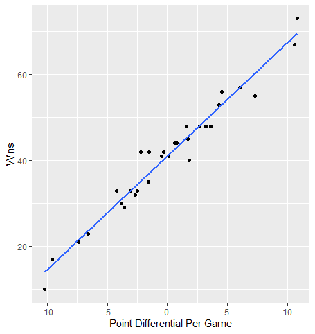
Lets take a look at the effect of PDiff/G on wins, W. PDiff/G is a column we created that shows the difference between a team’s average points scored per game and average points scored against per game. One would expect a higher value for this difference would result in more wins.
Let’s start by plotting the relationship between the two using a scatter plot.
library(ggplot2)

standings %>%
  ggplot(aes(x = `PDiff/G`, y = W)) +
  geom_point() +
  geom_smooth(method = "lm", se = F) +
  labs(x = "Point Differential Per Game", y = "Wins")

The blue line represents the line of best fit for this relationship (we’ll get into more detail in the next section). Overall, the variables appear to have a strong linear relationship as most points do not stray very far from this line.
Simple Linear Regression
Simple linear regression involves a dependent variable (what we are trying to predict) and one independent variable. In this example, we’ll try to predict how many wins a team has by their average point differential.
The linear regression model is implemented with the following equation: \(\\hat{y} = b\_{0} + b\_{1}x\) Here, $\hat{y}$ is our predicted value for the dependent variable. b0 is our intercept term; this is what our predicted value of y would be when the value of our independent variable is 0. b1 is the slope (referred to as the coefficient) of x, our independent variable. For every one unit increase in x, our predicted value of y would increase by this coefficient estimate.
The linear model estimates intercept and coefficient values that represent a line of best fit. Best fit is determined by what type of regression model we are using. The most common, and what we’ll be using today, is ordinary least squares (OLS). OLS determines best fit by whatever line minimizes the sum of squared residuals, or errors (differences between y and $\hat{y}$)
The function to create a linear regression model in R is lm. We use the same formula interface we did in previous lessons: y ~ x.
standings_lm <- lm(W ~ `PDiff/G`, data = standings)
standings_lm
##
## Call:
## lm(formula = W ~ `PDiff/G`, data = standings)
##
## Coefficients:
## (Intercept)    `PDiff/G`
##      41.018        2.639
Calling the lm object returns the intercept and coefficient estimate for the regression model. So for every one point increase in average point differential, we’d predict an additional 2.6 wins. Putting this in the context of our regression equation, our formula would be W = 41.018 + (2.639 * PDiff/G).
We can make win predictions based on the team’s average point differential using the predict function with our model as input.
predict(standings_lm)
##        1        2        3        4        5        6        7        8
## 56.85381 52.89476 45.24059 50.51933 49.46358 48.14389 45.50452 42.60122
##        9       10       11       12       13       14       15       16
## 37.05854 39.69791 36.79460 29.93224 33.89130 21.48626 14.09602 69.52279
##       17       18       19       20       21       22       23       24
## 68.99491 60.28499 52.36689 43.12909 40.22578 35.21098 41.28153 45.76846
##       25       26       27       28       29       30
## 34.41917 32.83555 30.98799 31.51586 23.59776 15.67965
We can see additional model information by calling summary on our model object.
summary(standings_lm)
##
## Call:
## lm(formula = W ~ `PDiff/G`, data = standings)
##
## Residuals:
##     Min      1Q  Median      3Q     Max
## -5.7685 -1.7118 -0.2127  1.3792  6.7890
##
## Coefficients:
##             Estimate Std. Error t value Pr(>|t|)
## (Intercept)  41.0176     0.5193   78.98   <2e-16 ***
## `PDiff/G`     2.6394     0.1025   25.75   <2e-16 ***
## ---
## Signif. codes:  0 '***' 0.001 '**' 0.01 '*' 0.05 '.' 0.1 ' ' 1
##
## Residual standard error: 2.844 on 28 degrees of freedom
## Multiple R-squared:  0.9595, Adjusted R-squared:  0.958
## F-statistic: 662.9 on 1 and 28 DF,  p-value: < 2.2e-16
The first thing we see is the distribution of residuals. Again, this is the difference between the actual value of the response and its predicted value.
Next, we get our coefficient table. This stores our coefficient estimates and their p-values. The associated null hypothesis is that our coefficient estimate is equal to 0; so in the case of PDiff/G, because the p-value is less than .05, we reject the null and say that the coefficient estimate is significantly different from 0. We also have Std. Error and t value columns. The standard error represents the variability of the coefficient estimate while the t-value is a standardized way of looking at the coefficient estimate (coefficient estimate / standard error) and is what the p-value is based off of.
We can also gauge how well the model performs in this summary output. The most straightforward way is by looking at the R-squared value. This is a number between 0 and 1 that shows how much variance in the response variable is explained by the model. R-squared values closer to 1 indicate the model explains most of the variance in y and is a strong model. What determines a good R-squared value isn’t universal and can change based on the topic. In some spaces, a value of .6 might be great while others might call it fairly weak. It all depends on the situation, but in general larger is better. The multiple R-squared is what we want to focus on in simple linear regression; average point differential accounts for about 96% of the variance in wins, indicating that our model is very strong.
This output is really helpful, but it’s not in a very clean and easy to manipulate format. We can use several functions from the broom package to put this output into tidy format.
tidy puts our coefficient table into a tibble. glance puts several different pieces of model output into a tibble. augment combines several pieces of model information, such as predictions and residuals, with our response and predictor values.
library(broom)

tidy(standings_lm)
## # A tibble: 2 x 5
##   term        estimate std.error statistic  p.value
##   <chr>          <dbl>     <dbl>     <dbl>    <dbl>
## 1 (Intercept)    41.0      0.519      79.0 1.89e-34
## 2 `PDiff/G`       2.64     0.103      25.7 4.91e-21
glance(standings_lm)
## # A tibble: 1 x 11
##   r.squared adj.r.squared sigma statistic  p.value    df logLik   AIC   BIC
##       <dbl>         <dbl> <dbl>     <dbl>    <dbl> <int>  <dbl> <dbl> <dbl>
## 1     0.959         0.958  2.84      663. 4.91e-21     2  -72.9  152.  156.
## # ... with 2 more variables: deviance <dbl>, df.residual <int>
augment(standings_lm)
## # A tibble: 30 x 9
##        W PDiff.G .fitted .se.fit .resid   .hat .sigma   .cooksd .std.resid
##    <int>   <dbl>   <dbl>   <dbl>  <dbl>  <dbl>  <dbl>     <dbl>      <dbl>
##  1    57   6        56.9   0.805  0.146 0.0802   2.90 0.000125      0.0536
##  2    56   4.5      52.9   0.695  3.11  0.0597   2.83 0.0402        1.13
##  3    48   1.60     45.2   0.545  2.76  0.0367   2.85 0.0186        0.988
##  4    48   3.60     50.5   0.637 -2.52  0.0502   2.85 0.0218       -0.909
##  5    48   3.2      49.5   0.615 -1.46  0.0467   2.88 0.00680      -0.527
##  6    48   2.7      48.1   0.589 -0.144 0.0428   2.90 0.0000598    -0.0517
##  7    45   1.7      45.5   0.548 -0.505 0.0371   2.89 0.000630     -0.181
##  8    44   0.600    42.6   0.523  1.40  0.0338   2.88 0.00438       0.500
##  9    42  -1.5      37.1   0.541  4.94  0.0362   2.73 0.0589        1.77
## 10    41  -0.5      39.7   0.522  1.30  0.0336   2.89 0.00378       0.466
## # ... with 20 more rows
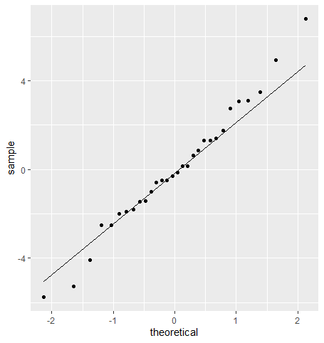
Of course, being a parametric model, there are also assumptions that come with linear regression. The first one is the normality assumption seen in previous tutorials. Specifically, we want to see normality of residuals. We’ll take a look at this using a QQ plot.
standings_output <- augment(standings_lm)
standings_output %>%
  ggplot(aes(sample = .resid)) +
  geom_qq() +
  geom_qq_line()

A couple of teams break from the line at the extremes, but for the most part, residuals appear normal.
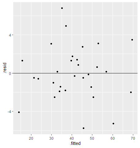
Our next assumption is constant variance of residuals. We want the spread of our residuals to be similar across all predicted values. To check this, we plot the predicted values against the residuals in a scatter plot, like so:
standings_output %>%
  ggplot(aes(x = .fitted, y = .resid)) +
  geom_point() +
  geom_hline(yintercept = 0)

For the constant variance assumption to be met, we should see points scattered evenly around 0 on the y-axis for all fitted values. If the assumption is not met, we’ll likely see our points form a funnel shape where the absolute error is increasing or decreasing across the x-axis. We don’t see that here, so the assumption looks good!
We can also use this plot to see if the model meets the assumption of linearity: that there is a linear relationship between the predictor and the response. As long as the residuals appear randomly distributed and don’t show any weird pattern, such as a curve, we can assume this assumption is met (and in this case, I say we meet it!).
Another assumption that goes beyond plots and more into how the model is developed that of independent observations. This essentially means that each observation isn’t influenced by other observations. An example where we could break from this is if you had a model which included separate points for team records before and after the all-star break. One would assume that a team’s record and stats prior to the all-star break influences their record and stats after the break.
To Be Continued
With simple linear regression under our belt, we can now make a basic predictive model. In the next tutorial, I’ll go over multiple linear regression, or regression with more than one predictor; from there we can really build into even more advanced modeling techniques!
