Linear Regression Pt. 2: Multiple Linear Regression
In the last tutorial, we went over simple linear regression with a continuous (numeric) predictor. We can expand on this idea by going over regression with categorical variables as well as regression with more than one variable. We’re going to be expanding on the same dataset we used in the last tutorial, so go back to that one if you want to go over how to scrape that again.
Simple Linear Regression with a Categorical Predictor
In the last tutorial, we saw how a numeric variable was used to predict
the dependent variable in simple linear regression. Predicting the
dependent with a categorical variable is slightly different both in how
it’s interpreted in the lm output and the linear regression equation.
Let’s look at the example from last week where we were trying to predict
team wins. We’ll add a new variable to our dataframe called Conference
that will show whether a team is in the east or the west. We’ll then use
this new variable to try and predict team wins.
library(dplyr)

standings<-
  standings %>%
  #the dataframe is ordered first 15 in the east, second 15 in the west
  #we can simply repeat east 15 times followed by west 15 times to create
  #the Conference column
  mutate(Conference=factor(c(rep("East", 15), rep("West", 15))))

head(standings)

##                        Team  W  L  PS/G  PA/G PDiff/G Conference
## 1 Cleveland Cavaliers* (1)  57 25 104.3  98.3     6.0       East
## 2     Toronto Raptors* (2)  56 26 102.7  98.2     4.5       East
## 3          Miami Heat* (3)  48 34 100.0  98.4     1.6       East
## 4       Atlanta Hawks* (4)  48 34 102.8  99.2     3.6       East
## 5      Boston Celtics* (5)  48 34 105.7 102.5     3.2       East
## 6   Charlotte Hornets* (6)  48 34 103.4 100.7     2.7       East
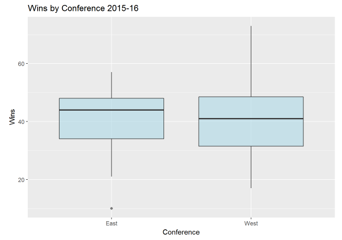
With our new categorical conference column created, let’s plot the relationship between conference and wins. Instead of a scatterplot, which we used with a numeric predictor, let’s make a box-plot.
library(ggplot2)

standings %>%
  ggplot(aes(x=Conference, y=W)) +
  geom_boxplot(fill="lightblue", alpha=.6) +
  labs(y="Wins", title="Wins by Conference 2015-16")

Just looking at the graph, it doesn’t look like we’ll see any sort of significant difference in wins by conference.
We’ll build a linear model using the same method we did last time with
the lm command.
set.seed(123)
standings.lm<- lm(W ~ Conference, data=standings)

summary(standings.lm)

##
## Call:
## lm(formula = W ~ Conference, data = standings)
##
## Residuals:
##      Min       1Q   Median       3Q      Max
## -30.5333  -8.4667   0.5333   7.4667  31.5333
##
## Coefficients:
##                Estimate Std. Error t value Pr(>|t|)
## (Intercept)     40.5333     3.6461  11.117 8.84e-12 ***
## ConferenceWest   0.9333     5.1563   0.181    0.858
## ---
## Signif. codes:  0 '***' 0.001 '**' 0.01 '*' 0.05 '.' 0.1 ' ' 1
##
## Residual standard error: 14.12 on 28 degrees of freedom
## Multiple R-squared:  0.001169,   Adjusted R-squared:  -0.0345
## F-statistic: 0.03276 on 1 and 28 DF,  p-value: 0.8577
Taking a quick look at the results, it doesn’t look like a great model. The R-squared value is below 1%, indicating that conference only explains about .1% of the variance in wins.
Something you might have noticed when looking at the coefficients was that the conference variable has been split and the results only seem to show for the western conference. That is because the coefficient values are interpreted differently for categorical variables.
Each level of a categorical value is given a dummy variable value of 1
or 0. Because we only have two variables here, the interpretation is
pretty easy; if conference is eastern, a value of 0 is given, while a
value of 1 is given if the conference is in the west. If there was a
third conference (let’s call it the middle conference) things would be
pretty similar; we would flag each variable that was middle or west and
everything left over would be east. As a result, the output would show
another coefficient value for the factor level ConferenceMiddle.
Remember in the last tutorial that the linear regression formula with a
numeric predictor looked like y = intercept + x*coef(x). A categorical
variable is sort of different due to the whole dummy variable thing. The
formula is still the same, but is more straightforward since our x can
either only be the dummy placeholder of 0 or 1. So if a team is in the
east, our x is 0, or W = intercept + 0*coef(ConferenceWest), and if a
team was in the west it would be
W = intercept + 1*coef(ConferenceWest). So all we are predicting is if
a team is in the east, they’ll have 40.5 wins (the intercept), and if
they’re in the west, they’ll have 40.5 + .9 wins, or 41.4 wins.
There isn’t anything special about why the west was given a coefficient and the east was not. It’s simply because R doesn’t flag the first level of a variable based on alphabetic order.
Because each level of the categorical variable is split, each has its
own p-value in the lm output. We can run an F-test using the anova
command to see if the categorical variable is actually significant.
anova(standings.lm)

## Analysis of Variance Table
##
## Response: W
##            Df Sum Sq Mean Sq F value Pr(>F)
## Conference  1    6.5   6.533  0.0328 0.8577
## Residuals  28 5583.5 199.410
We can see that the p-value is very large and above an alpha of .05. We can then assume that conference is not significant in predicting wins.
The same assumptions from the last tutorial apply, but I’m not going to go through them in this scenario.
Multiple Linear Regression
When we want to include more than one predictor in our model, we move from simple regression to multiple regression. We’re going to use a similar example to demonstrate this as we did in last week’s tutorial, but instead of using average difference in points to predict wins, we’ll use average points scored and average points scored against.
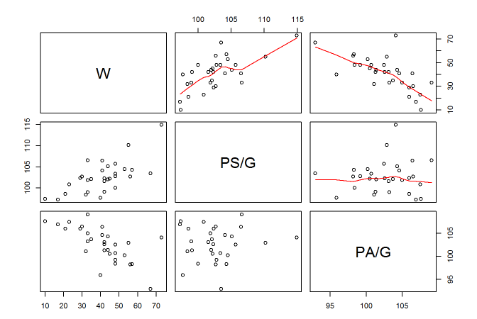
First, let’s look at the scatterplots of these two variables against
wins. Instead of plotting each individually, we can plot them all in a
scatterplot matrix using the pairs command.
pairs(standings[,c(2,4,5)], upper.panel = panel.smooth)

Here I indexed the three columns we’ll be looking at. I also specified that I want a smooth line in the upper panel. It looks like both average points scored for and against have a pretty linear relationship with wins, albeit in different directions.
The input for multiple linear regression is similar to the simple input.
We simply add each variable to the formula using a + sign like so:
set.seed(123)
standings.mult<- lm(W ~ `PS/G` + `PA/G`, data=standings)

summary(standings.mult)

##
## Call:
## lm(formula = W ~ `PS/G` + `PA/G`, data = standings)
##
## Residuals:
##     Min      1Q  Median      3Q     Max
## -5.7324 -1.7151 -0.2224  1.3844  6.8041
##
## Coefficients:
##             Estimate Std. Error t value Pr(>|t|)
## (Intercept)  40.3874    20.1567   2.004   0.0552 .
## `PS/G`        2.6424     0.1422  18.577   <2e-16 ***
## `PA/G`       -2.6363     0.1443 -18.267   <2e-16 ***
## ---
## Signif. codes:  0 '***' 0.001 '**' 0.01 '*' 0.05 '.' 0.1 ' ' 1
##
## Residual standard error: 2.897 on 27 degrees of freedom
## Multiple R-squared:  0.9595, Adjusted R-squared:  0.9565
## F-statistic: 319.6 on 2 and 27 DF,  p-value: < 2.2e-16
Let’s first look at the R-squared value to guage how well the two variables together explain the variance in wins. When we have more than one predictor, we want to shift our attention to the adjusted R-squared. This is important as regular R-squared will continuously go up with each variable added to the model, whether it is a good predictor or not. Adjusted R-squared tries to control for this, and should be used instead in any multiple regression scenario.
Looking at the coefficients section, both variables look significant in
predictings wins. The linear regression formula does change slightly to
y = intercept + x1*coef(x1) + x2*coef(x2) + ... xi*coef(xi) when there
are multiple predictors. So our formula for this model is
W = 40.38 + PS/G*2.64 + PA/G*-2.63. So a team that averages 95 points
per game and allows 100 points per game would be predicted to have
40.38 + (95*2.64) + (100*-2.63) or 28.18 wins.
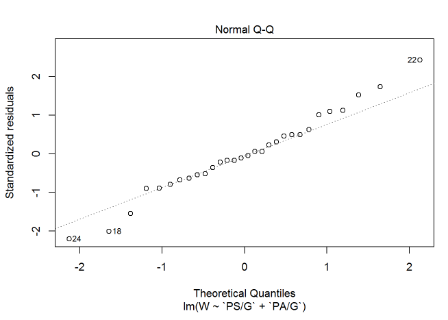
Let’s check out the assumptions we went over in the last tutorial. First we’ll check for normality of residuals using a qq plot.
plot(standings.mult, which = 2)

It does appear that a few points stray a little bit from the qqline. None of the points stray too far, however, so I think we can put most of that up to randomness and assume that the residuals are approximately normal. If it was more of an issue, we could get into transformations (though I’m saving that for a future post).
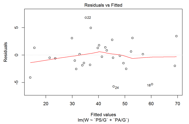
Next, let’s plot the residuals against the predicted value. This will help us check for constant variance and linearity.
plot(standings.mult, which=1)

Since the residuals mainly stick around 0 we can assume linearity. The smooth line also sticks around 0 and the residuals show no obvious trend, so we can assume constant variance.
With multiple linear regression, we also have to check if our predictors are correlated with each other. We of course want the predictors to be correlated with the response, but when the correlated predictors are related to each other we can run into issues of collinearity (or multi-collinearity if we have more than two predictors). Collinearity won’t necessarily effect our predictions, but it can warp our coefficients and resulting p-values to the point where we can completely misinterpret a variable’s significance.
There are multiple ways to check for collinearity, but my go to method
is to check the variance inflation factor (or VIF). I won’t get too into
the math here, but VIF is calculated by regressing each predictor on
every other predictor in the model. The R-squared is then taken and put
into the formula 1 / (1-Rsquared) for each variable. A VIF value is
then given to each variable. Anything between 5 and 10 is considered
fairly correlated while anything above 10 is a serious issue.
We can check the VIF value in R with the vif command in the usdm
library. You’ll need to first install the library and then load it in.
library(usdm)

vif(standings[, c("PS/G", "PA/G")])

##   Variables     VIF
## 1      PS/G 1.00384
## 2      PA/G 1.00384
It doesn’t look like either of the variables break that threshold of 5 so we don’t have much to worry about with collinearity.
With our assumptions out of the way, let’s make some predictions with our model. Here, I made a dataframe which has each team and their actual wins as well as the model’s predicted wins and the difference between the two.
compare<-
  standings %>%
  dplyr::select(Team, W) %>%
  mutate(Predicted_W=predict(standings.mult),
         Difference=W-Predicted_W)

compare %>%
  arrange(Difference) %>%
  head(3)

##                          Team  W Predicted_W Difference
## 1              Utah Jazz (9)  40    45.73237  -5.732365
## 2 Oklahoma City Thunder* (3)  55    60.30848  -5.308484
## 3    Philadelphia 76ers (15)  10    14.09549  -4.095486

compare %>%
  arrange(-Difference) %>%
  head(3)

##                          Team  W Predicted_W Difference
## 1     Memphis Grizzlies* (7)  42    35.19595   6.804054
## 2          Chicago Bulls (9)  42    37.05667   4.943332
## 3 Golden State Warriors* (1)  73    69.56422   3.435780
After creating the compare dataframe, I sorted the top 3 teams that
underperformed and overperformed based on the predicted amount of wins.
It looks like the Jazz underperformed by a bit as the model predicted
they would have almost 6 additional wins then their total of 40. On the
opposite end, the Grizzlies seemed to overperform by getting almost 7
additional wins then their predicted total of 35.
Linear regression is a pretty straightforward predictive model. It holds a lot of assumptions, but can perform well when their is a distinct linear relationship. It may seem like a lot now, but once we go over other predictive models in future posts, linear regression will seem pretty simple.
